A name, a logo, some colors, and type
I did get something done last week, amidst all the craziness: I’ve solidified the branding for my thesis! It seems a little early, but it was something I could complete that was independent of all the other stuff. So here it is!
Naming
I chose the name “Hotpot” last semester because it readily stands for what my thesis is about: cooking a delicious meal together in good company. I also love the imagery that it evokes: a big pot of bubbly goodness, ready to be shared.
In case you haven’t experienced the wonderfulness of this word yet, here’s some culinary trivia for you: a “hot pot” (火锅, literally “fire pot”) is a traditional Chinese method of preparing a meal that’s very similar to a fondue. Raw ingredients are brought to the table and everyone gathers around a big pot of simmering broth. To eat, you immerse your raw ingredient of choice in the hot broth, wait a few seconds until it’s cooked, then eat it with some dipping sauce. At the end of the meal, everyone divides up the broth—at this point more like a rich stew—and drinks it in little bowls. Because it’s taken on the flavor and depth of everything that’s been cooked in it, this is arguably the best part. Hot pot is a symbol of friendship and the closeness of families, and it is literally communal cooking at its best.
Side note: I’m aware that Google currently owns Hotpot.com. Hotpot actually used to be the name of their recommendations engine for physical places, but they’ve thankfully changed it to be called Google Places. Which is good because the name Hotpot did not seem to fit the service. Hey Google, if you’re reading this, would you like to donate that domain name to me? It fits my project way better! ![]()
Logo
In the wake of doing that personality exercise a couple weeks back, I spent some quality time with MyFonts.com and Illustrator, and created a logo! It’s chunky, it’s spunky, and optimistic too. Here it is (without the tagline lockup):
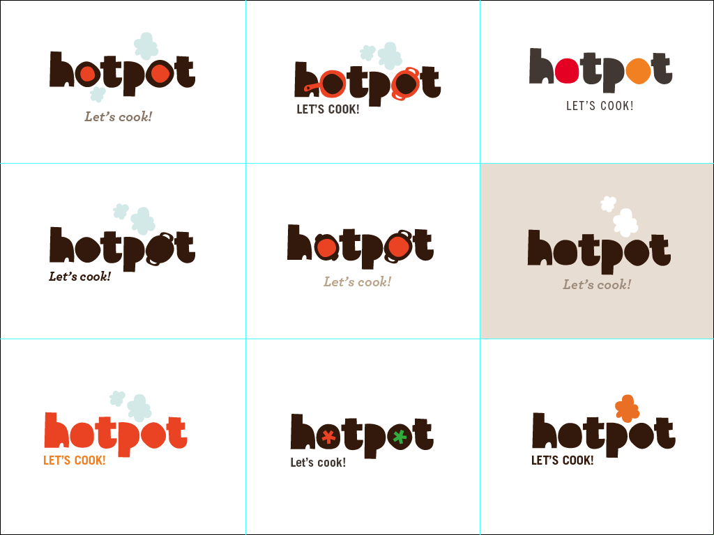
And here are all the crazy iterations I went through (including trying pretty hard to fit a pot or two in there):
It’s based on Embryo by HVD Fonts, with a slight redrawing of some letters to give it more variation. I’m quite fond of how these shapes are reminiscent of paper cutouts, and the puffs can be read as both steam and smoke. Hey, not all cooking experiments turn out well, and I’m a firm believer that you should enjoy your time in the kitchen regardless.
Colors
For colors, I really wanted a palette reminiscent of a sunny, contemporary kitchen. So I looked all over the web (okay, I really just looked on ApartmentTherapy.com - a.k.a. kitchen porn central) for inspiration. Here are some kitchens to drool over:
And here is the palette I created based off of these, using the wonderful ColourLovers.com:
Typography
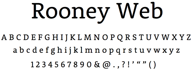
Finally, I chose some letterforms. For headings I picked Rooney Web, which has a nice round friendly feel.
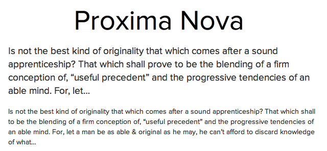
For body type, I picked Proxima Nova. It has similar though not exactly identical proportions to Rooney, but overall the look is also very friendly and straightforward and it has that contemporary geometric feel with big round counters, without actually being stiffly geometric.
Both of these fonts are available on the fabulous Typekit, so I can deploy them easily. Hooray!


